Just messin’ with CSS rotation/animation effects etc. — Yeah, OK kinda pointless with little or no value in terms of practical application… HOWEVER, staring at this thing for any length of time may (in some cases) induce a cheap high in the form of a pleasantly mild psychedelic flashback experience…

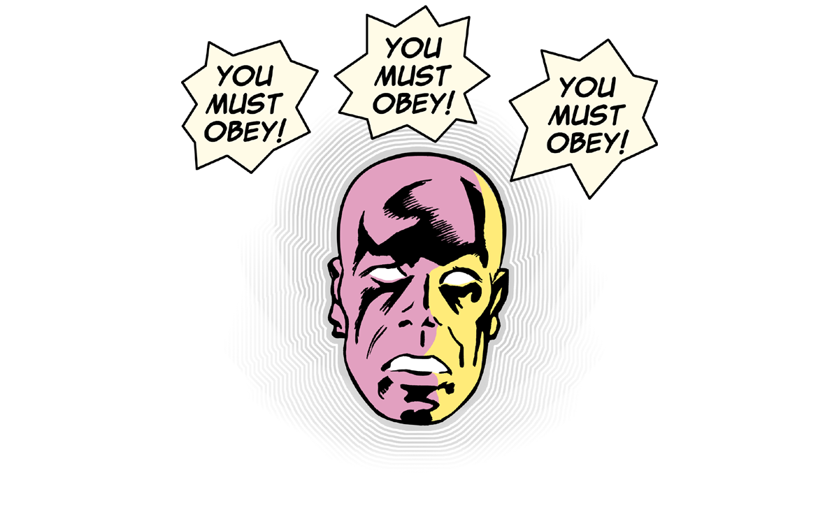

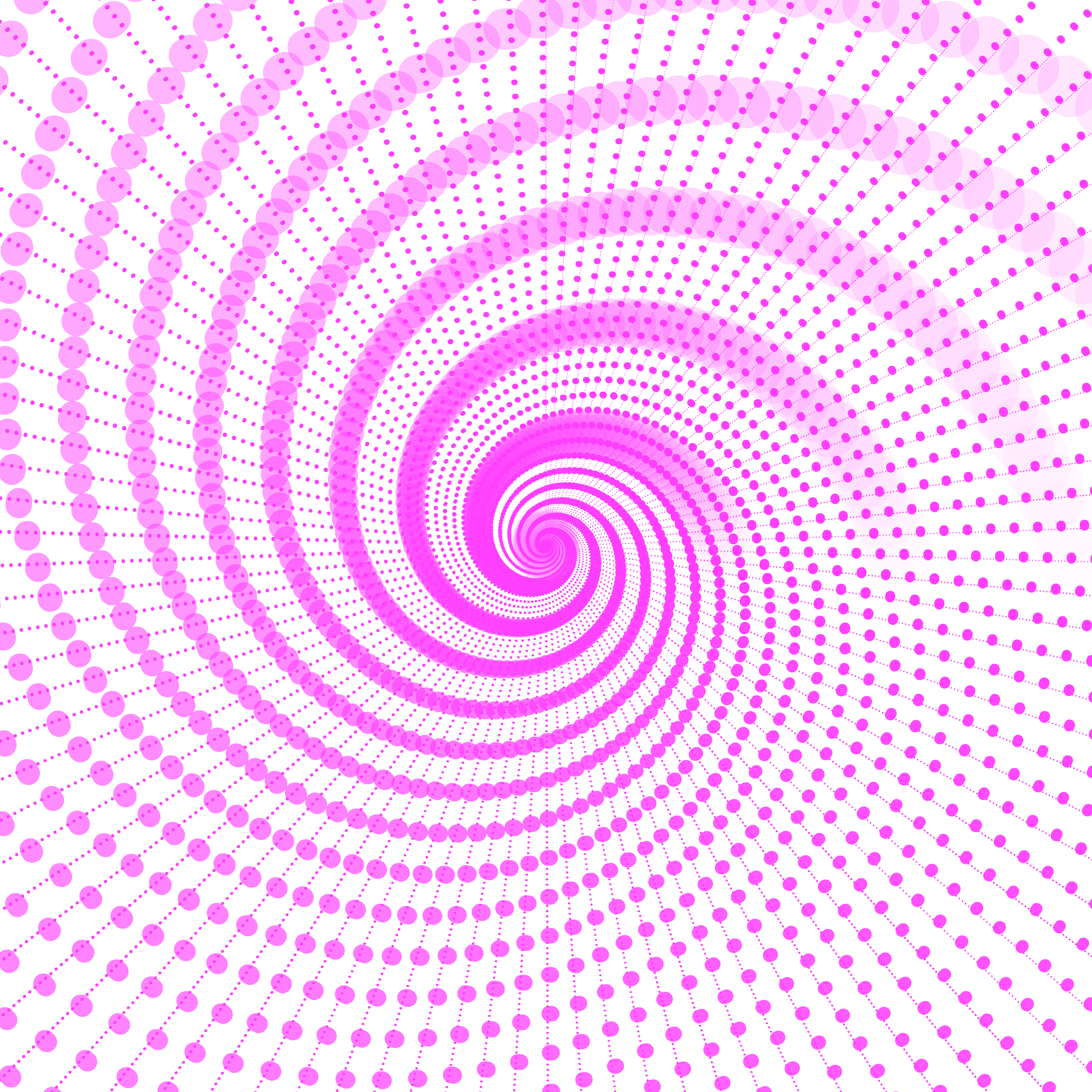

Images Used
.png and .webP format images with transparent backgrounds.

overlay image w/ transparent BG

transparent placeholder

bg image A w/ transparent BG

bg image B w/ transparent BG
The HTML
Copy & paste the following into your post’s edit window:
<div id="animElemOuter">

    <div id="overlayElement">
        <picture>
            <source type="image/webp" srcset="https://www.mywebsite.com/wp-content/uploads/images/mustObey.webp">
            <source type="image/png" srcset="https://www.mywebsite.com/wp-content/uploads/images/mustObey.png">
            <img src="https://www.mywebsite.com/wp-content/uploads/images/mustObey.png">
        </picture>
    </div>

    <div id="animElemBoxA">
        <picture>
            <source type="image/webp" srcset="https://www.mywebsite.com/wp-content/uploads/images/spinFLA3.webp">
            <source type="image/png" srcset="https://www.mywebsite.com/wp-content/uploads/images/spinFLA3.png">
            <img src="https://www.mywebsite.com/wp-content/uploads/images/spinFLA3.png" alt="animated element">
        </picture>
    </div>

    <div id="animElemBoxB">
        <picture>
            <source type="image/webp" srcset="https://www.mywebsite.com/wp-content/uploads/images/spinFLA2.webp">
            <source type="image/png" srcset="https://www.mywebsite.com/wp-content/uploads/images/spinFLA2.png">
            <img src="https://www.mywebsite.com/wp-content/uploads/images/spinFLA2.png" alt="animated element">
        </picture>
    </div>

    <picture>
        <source type="image/webp" srcset="https://www.mywebsite.com/wp-content/uploads/images/placeHolderM.webp">
        <source type="image/png" srcset="https://www.mywebsite.com/wp-content/uploads/images/placeHolderM.png">
        <img src="https://www.mywebsite.com/wp-content/uploads/images/placeHolderM.png" style="width: 100%;" alt="placeHolder element">
    </picture>

</div>
The CSS
Copy & paste the following into your theme’s CSS editor (Appearance > Customize > Additional CSS):
#animElemOuter {
    width: 95%;
    position: relative;
    overflow: hidden;
    margin: 20px auto;
    background: #ff7e7e;
}

#overlayElement {
    position: absolute;
    top: 0px;
    left: 0;
    width: 100%;
    z-index: 10;
    opacity: .8;
}

#animElemBoxA {
    position: absolute;
    top: -57%;
    left: -16%;
    width: 130%;
    margin: 0px auto;
    animation: rotation 5000ms infinite linear;
    animation-name: AnimElem;
}

#animElemBoxB {
    position: absolute;
    top: -57%;
    left: -16%;
    width: 130%;
    margin: 0px auto;
    animation: rotation 4000ms infinite linear;
    animation-name: AnimElem;
}

#animElemBoxA img, #animElemBoxB img {
    width: 100%;
}

#animElemBoxA img {
    opacity: 1;
}

#animElemBoxB img {
    opacity: .5;
}

@keyframes AnimElem {
  from {
    transform: rotate(0deg);
  }
  to {
    transform: rotate(-359deg);
  }
}
*Some additional jQuery used for the ‘Run Animation’ & ‘Stop Animation’ buttons, not documented here.


